This project is a side-by-side comparison between two mapping projects: one covering the 1760 – 1761 slave rebellion in Jamaica and one covering racial terror lynchings in the United States from 1877 – 1950.
Slave Rebellion in Jamaica, 1760 – 1761
The first of the two mapping projects hit an immediate problem, however. Either Jamaica is a much less interesting place than I’ve been led to believe, or the “map” portion of this project’s webpage is non-functional.

The “blog” section is likewise broken, but the “project,” “sources,” and “acknowledgements” sections are intact, leaving a good deal to work with. The project write-up discusses the design choices and philosophies behind the (now theoretical) map, allowing a comparison with the other item.

The most notable feature is that the map is designed to invoke a sense of the mid 18th Century by mimicking the mapping practices and aesthetics of that period. This is an unusual choice given the subject matter; in my experience, periodized maps are usually made for projects with a sense of “adventure” to them, ones meant to immerse users in the period. We may be hard pressed, however, to find users interested in immersing themselves in the rather bleak setting of a slave revolt quelled through mass summary executions. Stanger still, the map is imitating the style of the colonial powers of the period. This is an odd decision given that the project write-up states that the imperial perspective of source materials makes accurate study of the rebellion’s events difficult.

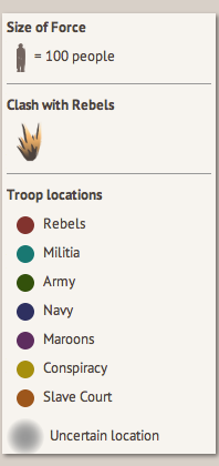
Beyond that quirk, the rest of the project appears to have been quite standard issue. The legend, seen below, does not attempt to imitate period styles in the way the map itself does, selecting quite simple icons for events. I should note the presence, however, of the “uncertain location” designation, both in the map legend and the project write-up. This is a useful feature that I would like to see replicated on more (and ideally extant) mapping projects. Data obtained from old and often unreliable sources is frequently vague, confusing, or outright contradictory. This can be difficult to represent on a map which, by the nature of the medium, is a quite concrete representation. This is the simplest solution to the problem I’ve seen to date.
While the loss of the map itself is unfortunate, the slave rebellion project appears to have been a useful, if strangely designed, tool. If it could be repaired, this map would find quick use by academics.
Lynching in America
The lynchings map, beyond just being functional, comes with a very modern appearance. Users can mouse over a state to see state-wide data or click on the state to see data broken down by county instead. The handful of white dots represent playable media on a specific lynching, which can be viewed by clicking on them.

The map itself is simple enough, although it offers relatively little information. Even the county-level breakdown simply provides a number of lynchings. This data is itself a fairly interesting subject, however, thanks to the term used by the project’s creators: “Racial Terror Lynchings.” This term is mentioned in the upper left-hand corner of the general map but not defined. The county-level map simply notes the numbers it provides as “reported lynchings.”

The project’s creators actually have a quite restrictive view of the term “racial terror lynchings” which would never be apparent to a user looking only at the map itself; information about that definition is displayed in a write-up on a different part of the website. I would never have noticed this had I not been doing independent research on lynchings in Obion County and thought the number 16 sounded low; my sources had placed at least 21 racial lynchings in Obion County during the same time span.
The issue isn’t the definition of racial terror lynching used, but rather the presentation of data. Listing the numbers on the map as simply “reported lynchings” implies that this is a complete data set; in fact, it is only reporting a specific type of lynching. This could be resolved with a fairly simple fix by using the complete phrase “racial terror lynching” in the county-level data and adding a link to the text at the top right to their definition.
Comparison
Both maps are effective tools to display their respective data sets, although both also contain oddities which may lead casual users astray. In the former map’s case, there is likely little recourse; altering the core design of the project would necessitate a complete restart (although, given the map’s current state, this may be a prime opportunity to do just that). In the latter’s case, the fix is a fairly simple display issue that can be addressed with a couple lines of text.