Categories
Digital Humanities Coursework

Optional Project 53

The Future of Digital Humanities

Digital Humanities is still a new concept to much of the academic community. Perhaps this is unsurprising; academia is a world of entrenched ideas where seniority is respected and few young workers are able to replace aging personnel. It should be no surprise that its leadership isn’t rushing to embrace every new advancement on the day it comes out. There are also very real concerns about the longevity and security of digital humanities projects which have left a number of my colleagues rightfully skeptical of the digital. In particular, corporate practices surrounding subscription models and AI allow Microsoft and similar companies to effectively hold academic work hostage or even steal it wholesale.

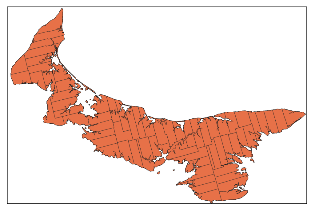
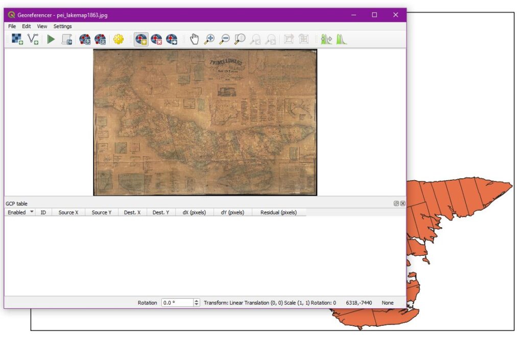
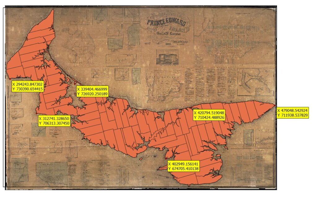
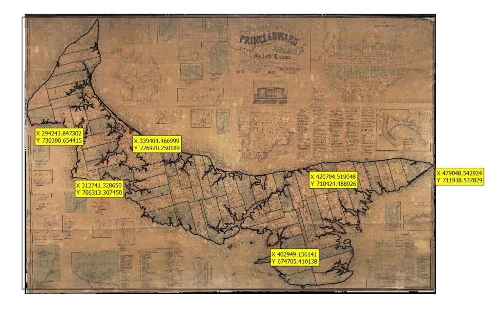
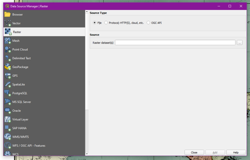
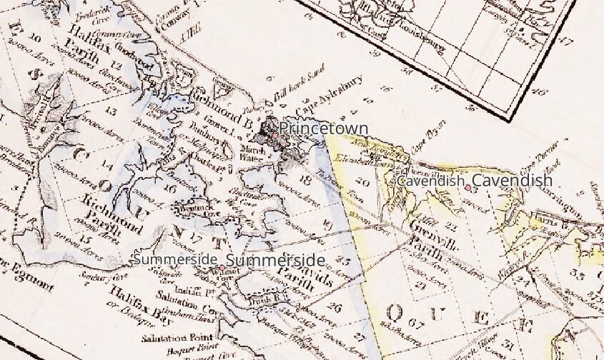
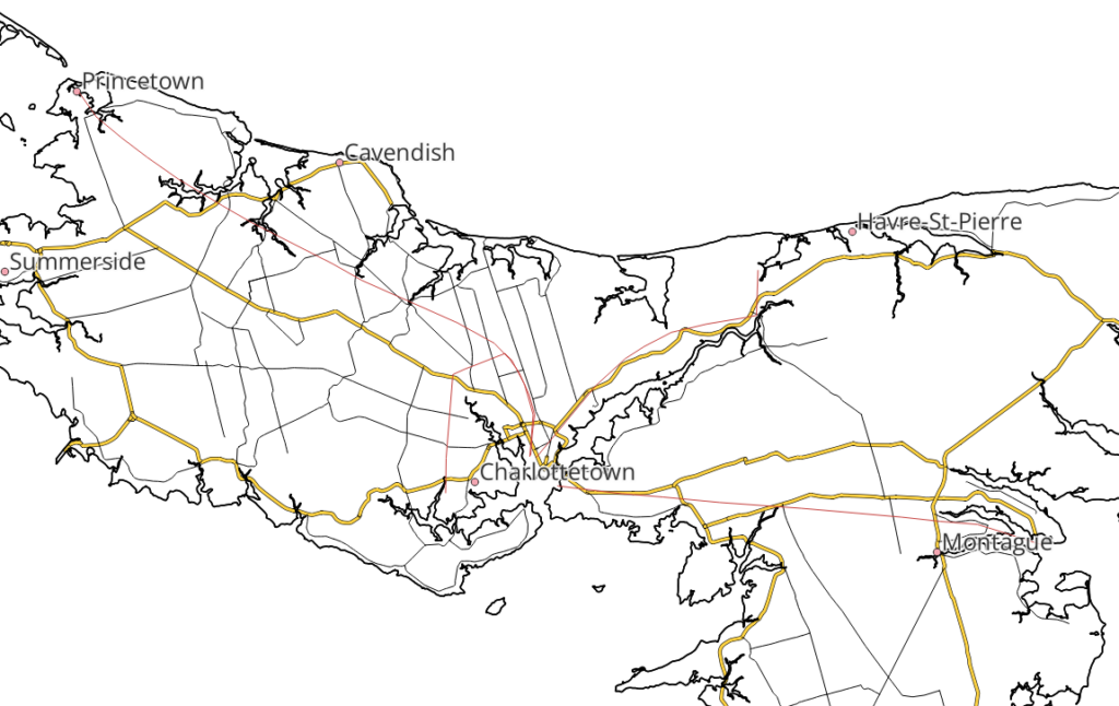
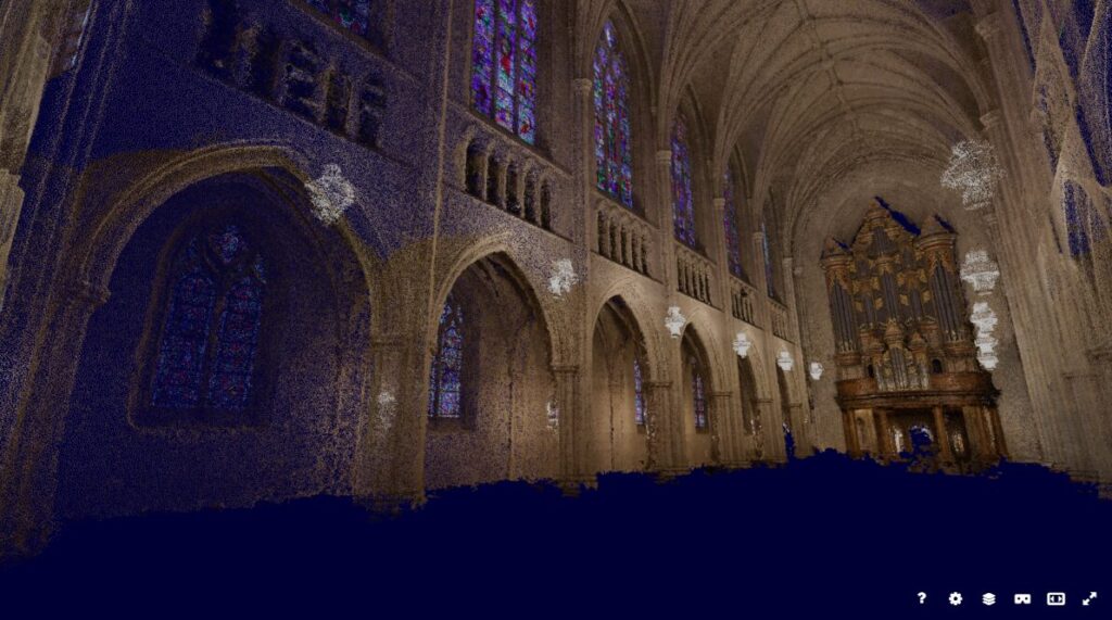
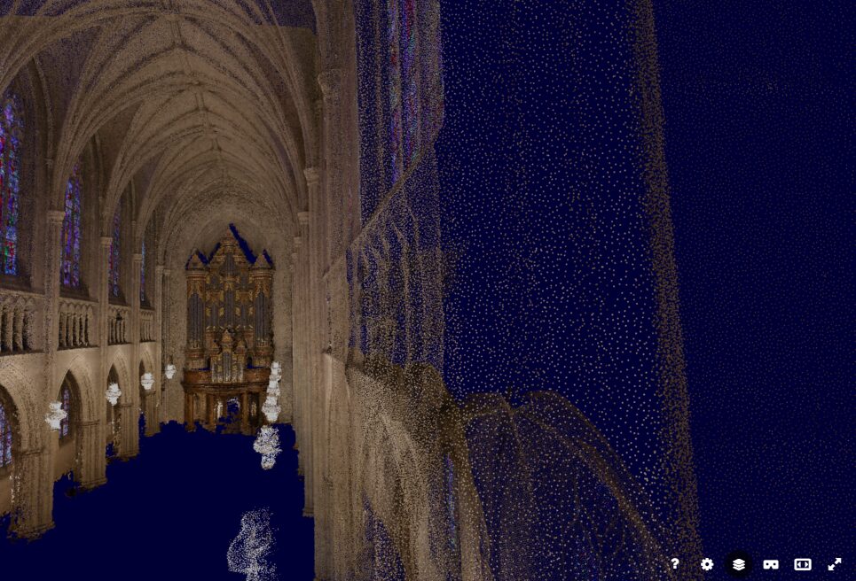
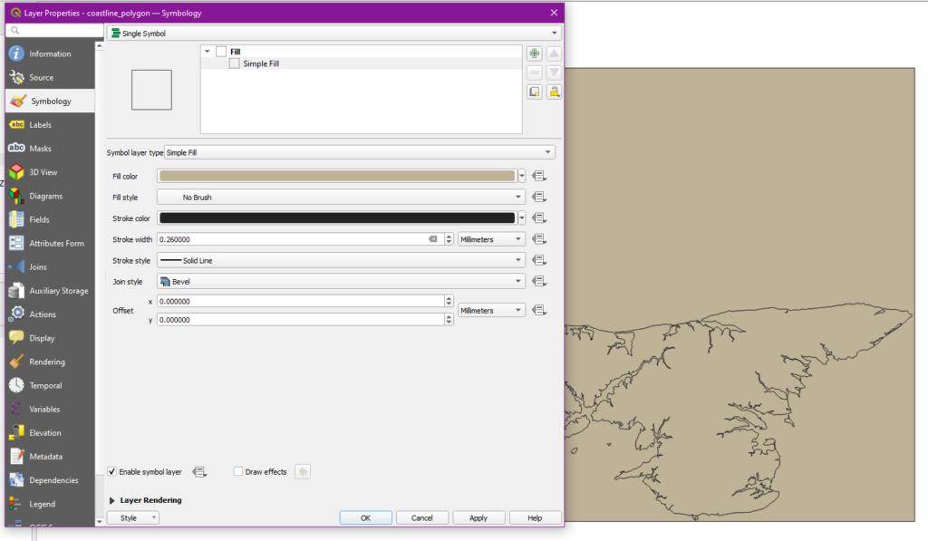
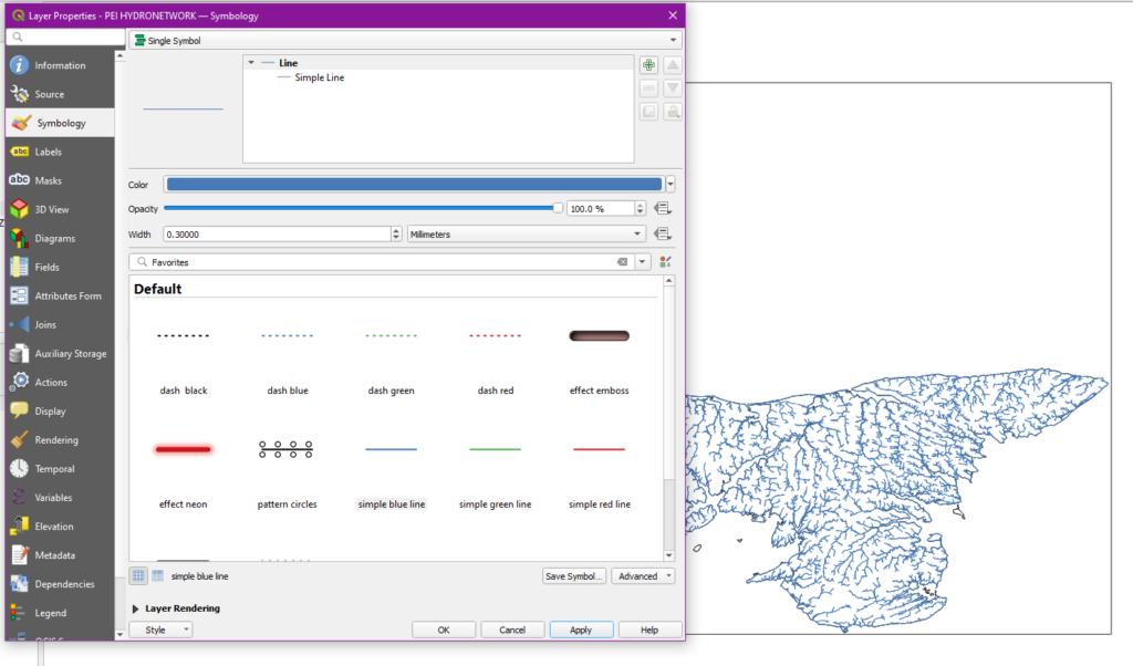
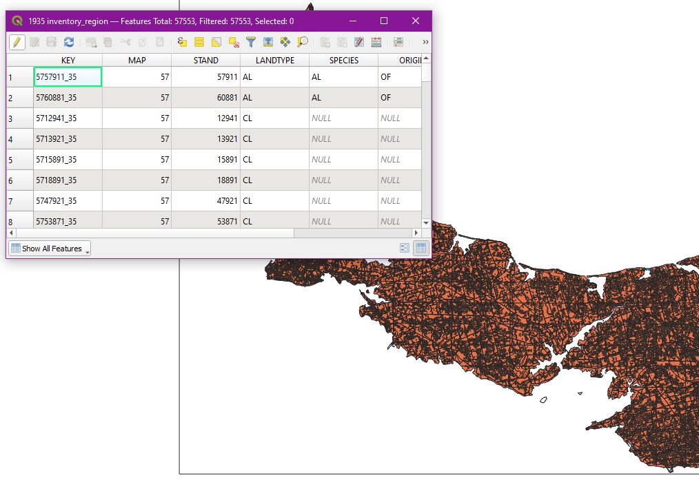
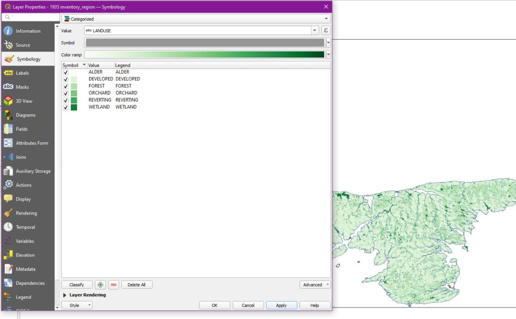
While cheaper and safer alternatives exist, they aren’t exactly making themselves user-friendly. Take QGIS, for example. I’ve noted in the past in these posts how effective and excellent this program is, but look at the user interface.

The number of buttons on this screen is frankly terrifying, even to someone who grew up with computers like me. My grandmother wouldn’t know where to start with this and plenty of academics fall in her range of digital technical skills. “Just learn it” works for one or two programs; it’s what I’m doing with QGIS. But that mindset falls apart when a dozen programs become interconnected, as is often the case with digital humanities projects. Unless a specific set of programs with great longevity and security are made part of the professional training for historians, these programs will remain the niche abilities of just a few of us.

My Future with Digital Humanities

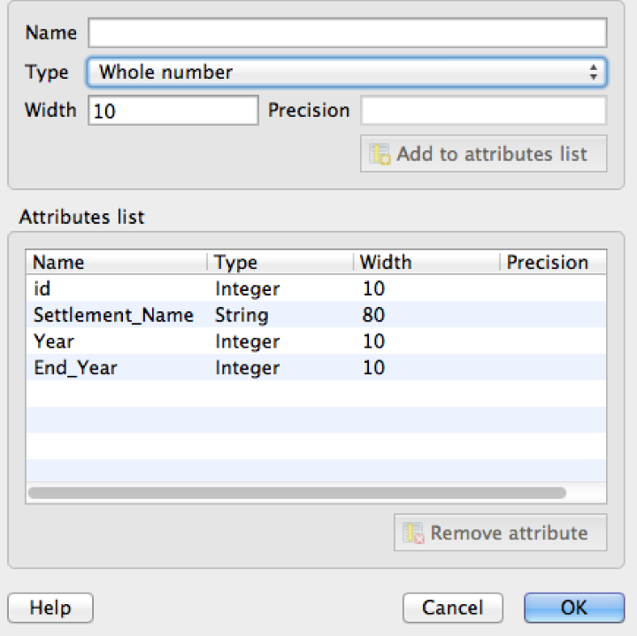
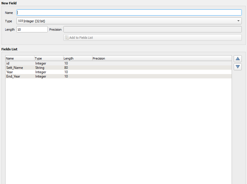
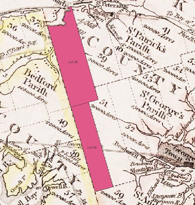
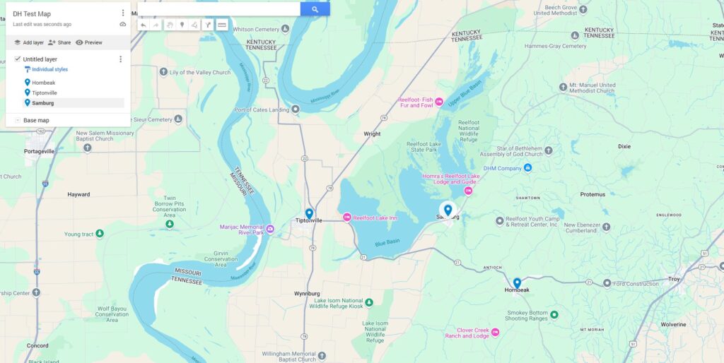
I plan to continue the use of both this website and the QGIS program as I move forward in my academic career. In particular, I hope to use QGIS to create an interactive map of Europe which will display text entries from Merovingian primary sources by their years and the locations referenced. This is something I originally did (in a limited format) on paper several years ago; the opportunity to expand it to a functional interactive map will be incredibly rewarding. At the same time, I’ll need a bit more training to make it happen. While I’m fairly certain I could make a decent mockup of what I’m looking for just using the layers window, I also suspect that QGIS has more specific tools buried in it that will help me with just what I’m looking for. In either case, I look forward to getting this project off the ground in the near future.

Categories
Digital Humanities Coursework

Optional Project 51/52

For one more time, I’m returning to QGIS to work with the Prince Edward Island project outlined on Programming Historian. For this project, I’ll be focusing on Georeferencing. Right away, however, I ran into just how outdated the Programming Historian lesson is as it tries to get me to download an extension, Georeference GDAL, which has apparently been integrated into QGIS for years now. Skipping that step, I got the new data integrated, showing the lots of Prince Edward Island.

With that in place, I likewise downloaded a vintage map of the island and got it set into the Georeferencer system.

Once this was set up, I started adding georeference points across the island. Since the assignment called for working outside of the three points in the Programming Historian lesion, I was mainly looking to match obvious coastal features between the two maps. After that was complete, I ran the georeference program and got this map as a result (after swapping a few layers around).

Returning to some basic tools from the previous set of lessons, I removed the fill color, leaving only the lines designating lot boundaries and coastlines on top of the vintage map. Everything appears to have lined up nicely in this case.

The utility of layering older maps onto newer ones should be obvious to any historian. Since older maps commonly show the locations of things which no longer exist, linking them to newer maps can be a great tool when searching for the locations at which said things once did exist. On the Prince Edward Island map above, for example, linking the two maps could be a great aid when studying disputes over lot lines. Adding back in the layers used in previous projects on this map, we could track roads, ports, population movements, and any number of other items. QGIS is a valuable tool that comes at the right price (free). I anticipate it will become involved in a number of my future efforts.

Categories
Digital Humanities Coursework

Optional Project 46/47

This project returns to the QGIS map of Prince Edward Island I worked with previously in Optional Project 32. The first step in this continuation was to add a new raster layer in which to include the new map.

After getting the new map set up (which involved some inconclusive alterations to the settings; I’m not entirely sure they worked as intended), I had a new version of the map which was just a little crooked.

The next step was to add in a new vector layer. This became a problem because, as with the previous QGIS project, the Programming Historian’s guide is out of date and no longer representative of the way QGIS currently works. Some items were renamed and (strangely) it seems that a character limit was introduced into one of the data fields, which is why “Settlement_Name” had to become “Sett_Name.” See their version and mine below.

After this point, I needed to manually enter a number of new points on the map, recording the founding (and in some cases end dates) of several towns across Prince Edward Island. I also stepped outside of the instructions as before to make the place names a little more readable.

The next step was to trace some of the original roads from 1798 for a comparison to the modern ones provided in the government map of the island. There were some differences, to say the least, although my hideous misrepresentation of Charlottetown’s location is probably not helping matters.

The final segment had me drawing out some lots on the island to demonstrate the polygon tool (and the snap feature associated with it). This turned out to be a much easier task than I had anticipated. I wasn’t able to get that last piece of Lot 38 included, however, thanks to the bay and spent a long time trying to figure out how to do so. I’ll probably return to the program later to keep working on that.

Categories
Digital Humanities Coursework

Optional Project 40

Using some of the photos deployed in my Omeka Project from last week, I’ve demonstrated some of the capabilities of the TROPY system. Tracking down and installing TROPY was simple enough and followed pretty much the same steps as Zotero.

Once the program was ready, I populated it with some of the images I had saved to complete my Omeka Project on Merovingian material culture. The visual comparison to Zotero is an obvious point to make here; the developers have used pretty much the same interface for both.

I then set about entering some metadata for the images. All but two of these photos were retrieved from the British Museum, so I completed these as a set. I discovered that TROPY was displeased when I attempted to copy and paste information into the metadata fields; this, sadly, meant typing out the specific copyright statements I’ve been using by hand.

Next I added in some tags to my photos. “Merovingian Material Culture” seemed a good pick for all of them. I also added some tags which divided the photos based on the type of item: household item, state product, clothing, and weapon. While overkill for the small number of photos I have, these tags would be useful for an expanded project on the subject if I had to deal with more images.

As a final aid for this theoretical expansion, I assigned all of the subcategories a color code to make the type of item easier to identify in passing. At this stage, I could easily go on to create a larger project on Merovingian material culture; with a couple modifications, I could also expand beyond the Merovingian world to include examples from other contemporary civilizations by adding further tags.

Categories
Digital Humanities Coursework

Optional Project 41

For this project, I’m taking two sites discussed in previous projects and examining their design for accessibility, both in terms of disability and other cultures.

Lynching in America: Confronting the Legacy of Racial Terror

Originally seen in Optional Project 31, Lynching in America seeks to map instances of racial terror lynchings in the United States. I remembered this site in particular because of its color gradient map, using shades of red to represent the number of lynchings in any given county. This, I would imagine, could raise issues for colorblindness.

On the cultural side, there’s a more pressing issue. Users have to look fairly hard to find out what lynching is. The initial description of the project shown below does little to clarify what a lynching is and, as I have discovered in recent online circles, even English speakers outside of the US are often either unfamiliar with the term or use it differently; the American term usually implies the killing of the victim while other versions may simply constitute assault or harassment.

Some extra colorblind modes, perhaps with the number of lynchings attached to the county on the map, could help with accessibility here. A full definition of lynching would also help, as I’ve mentioned in my previous post on the site.

Google Arts & Culture

In Optional Project 37, I looked over, among other sites, Google’s Arts & Culture page. Assuming that at least some part of the company’s fortune had gone towards it, I had high expectations for this site’s accessibility. It seems to have done well in this regard; nearly everything it has in text is black on white or white on a darker color.

While the size of the site makes it impossible for me to check everything (at least for the scope of this project), the cultural readability also seems in good shape. This isn’t to say that cultures are well-represented; the Vietnam War display, for example, was almost exclusively American photography or posters and focused as much on American civilian life as it did anything inside Vietnam. This is a matter of perspective more than readability, however; it doesn’t seem like anything would be difficult to understand here, just relatively one-sided.

Without going into specific exhibits, I don’t have any large complaints for this site. I would recommend perhaps relabeling some displays to put their point of view (usually very American) in focus, however.

Categories
Digital Humanities Coursework

Omeka Exhibit

Leaning on my work in my M.A. Thesis, I have created a gallery of Merovingian material culture for my Omeka Exhibit. I’ve noticed when speaking with members of the public (or even academics not directly involved in Late Antiquity) that most appear to believe that the collapse of Roman authority in the 5th Century was the end of nearly all cultural and economic activity in Europe for some time. This exhibit demonstrates that to be untrue, displaying some of the surviving items being created during that period.

My first step was tracking down the items I would use and putting them into Omeka with their metadata. I drew my initial items from the American Library of Congress, which has in turn been supplied a number of digital items by the National Library of France, but all but one item were manuscripts. I included a few of these books but wanted a more diverse spread of material culture for the exhibit.

The British Museum turned out to be a good source for Merovingian items, perhaps unsurprisingly. Many, while catalogued, had no digital images available, but there were still plenty of options available. The British Museum also has a standardized format for citation and use of their images, which was remarkably helpful.

Once all of the items were in order, I got them set up into a unified collection and began working on my exhibit. I decided to split it into three sections: a combined Introduction & Rationale, a Guide, and a Gallery for the images themselves.

I did notice at this point that I had forgotten to set my items to public view and had to go back to do so. Thankfully, the editing process was fairly painless.

Once the exhibit itself was in good shape, I looked into ADA accessibility. There were some limitations inherent to the subject I was working with since the exhibit was of still images of material culture. The captions describe the items as best as possible, but relatively little information is available on some of the images. Beyond that, no part of the site relies on color coding and color contrast appears to be in good shape.

Categories
Digital Humanities Coursework

Optional Project 39

This project compares the Duke Chapel 3D model project and the panoramic photos provided by the Mapping Gothic France project.

Duke Chapel

The Duke Chapel 3D model is the result of photogrammetry, the combination of multiple (in this case, 1,430) photos into a single set. The result is a 3D model, as seen below.

There is not, in this case, a lot of additional data from the project. It seems to have been carried out mostly to teach the method to prospective researchers, so there is little effort put into documentation outside of basic attribution. The model itself, however, has some shortcomings on the matter of detail. Because it is constructed out of tiny points with dead space in between, when a user attempts to zoom in to see the structure’s detailing, the image breaks apart, as is demonstrated below.

The result severely reduces the project’s value to researchers. Without access to the original photos, users are left with just a basic outline of the building’s shape and color. Assessing anything in closer detail would require separate data or their own visit.

Mapping Gothic France

Unlike the Duke Chapel project, Mapping Gothic France is a large, multi-structure affair covering dozens of cathedrals across France and formerly French-controlled areas. Each can be selected for further information from this map by clicking on the relevant point.

Also unlike the Duke project, this one has no shortage of data. Mapping Gothic France is quick to provide users with bibliography, floor plans, and anything else it can get its hand on.

The key comparison between the two projects, however, is the panorama. While not manipulable, this image is high-resolution and provides all of the detail which was lacking in the Duke project.

While users can’t see certain parts of the church, such as those obscured behind pillars, the Duke project loses coherency when users zoom close enough to check in such places anyway. As a research tool, the panoramic is a clear choice.

Categories
Digital Humanities Coursework

Optional Project 37

The project looks over a series of virtual tours from Google, Cyark, and Open Heritage 3D. I then provide some general thoughts on the subject of virtual tours.

Google Art & Culture

Google’s approach seems the most traditionalist. It provides a scrolling webpage with brief captions. The brevity of the tour was rather severe; the whole affair took about three minutes and each slide only provided a couple lines of text. The page displayed below is from a tour of the castle near Fujairah’s fort in the United Arab Emirates, but other tours seemed to fall in a similar length. The experience felt closer to a tourist guide than a “tour” itself.

Cyark

The most useful of the three program appears to be Cyark’s 3D virtual tours. The Fujairah Fort also features on this site, but in a manipulable 3D format, so I’m using it as my example once again.

Each of the numbered points on the screen can be selected to view a short paragraph on the feature of the structure it’s attached to, as seen below.

This feature is welcome, though not always fully functional. It drags the screen to wherever the feature is, regardless of whether the informational tag can be read, as is the case with #3 (shown below with the tag “opened”). Other tours had similar struggles.

Though a little difficult to control, the Cyark site seems to be the best of the three options by far, allowing a user to manipulate a location in full 3D without losing readability.

Open Heritage 3D

As a disclaimer, it is possible that technical issues could have contributed to my issues with Open Heritage 3D. The models seemed not to fully load, gaining more detail when I zoomed in on a specific spot, but never keeping up the detail across a wider area, even given around 30 minutes to do so. In either case, the below image is representative of my experience on the site.

The shapes of some buildings are clear, but most of the terrain and vegetation remains an unidentifiable mess. There also seem to be strange streaks emanating from the ground; these only appeared in some of the models, so I have no idea if they are intentional or what they could represent. Regardless, general readability was poor in every model I sampled.

The models, while potentially useful if cleaned up with the right software, are too confused and dysfunctional to be usefully employed at the present moment.

General Thoughts

Virtual tourism is a concept which has been on the horizon for some time, but it is only now coming into the realm of possibility as technologies like virtual reality are being pushed down to the public. At its core, virtual tourism is a valuable way for members of the public to view and interact with important historic and cultural sites from across the globe. This is ever more important in the current period as increasingly nationalist governments are damaging the ability for scholars and tourists alike to cross borders and access such significant locations.

On the other hand, virtual tourism cannot (at least under current or near future technology) replace “boots on the ground” tourism. Sight is only one sense and even the visuals themselves are not nearly as interesting as those seen in person, in the sense of both personal enjoyment and academic interest. Virtual tourism is a less desirable substitute to be used when access to the location in question is too dangerous or expensive.

Categories
Digital Humanities Coursework

Optional Project 33/34

Google Maps

This project follows the use of data sets in Google Maps and Google Earth. Once I had my account settings sorted out and a test map pulled up, I selected a trio of towns which I’ve been researching recently and “added” them to my map.

Deleting those test items, I went forward with the provided dataset. This spreadsheet provides data on the British sources for “fats” (mainly oils) from the period of 1894 – 1896.

My next task was to change the style to “by commodity,” but I ran into a bit of trouble here. The Programming Historian lesson appears to be on a different version of this software than I am, so it took a minute to work out the layout. Mine ended up looking like this.

The next set of instructions had me swap the base map to a satellite image and put down some place markers, so I returned to the same set of towns from the beginning of this project.

In the next layer, I was to trace a road and add a polygon. I followed the main road going between Tiptonville and Hornbeak and outlined the rough site of a saloon I’ve been tracking the location of.

Google Earth

Getting started on Google Earth was quite freeform. I was encouraged to look around and familiarize myself with the settings, including the option for historical maps.

After this, I moved on to KML files. I exported the text map I made during the Google Maps section as one such file and applied it into my Google Earth application. The file now appeared in 3d on my Google Earth.

At this stage, the Programming Historian lesson had a polygon to place around Lake St. Claire near Detroit. Helpfully, Lake County, Tennessee also contains a lake of some note (Reelfoot), which I outlined with my own polygon as seen below.

The last item was to overlay a historic map onto the Earth project. I tracked down a 1930’s map of Lake County and (with substantial difficulty) abused it into mostly fitting the satellite imagery. The town of Samburg has been plunged into Reelfoot Lake, but I’ve been told it wasn’t terribly impressive to begin with.

Once saved, that was the end of the Google Maps/Earth training on Programming Historian. The lesson was interesting and I see plenty of uses for these programs, particularly on collaborative projects. The ability to share marked-up maps with one another will be invaluable in such a context.

Categories
Digital Humanities Coursework

Optional Project 32

The QGIS project which we began in class went fairly quickly as I ran through the same steps again. Once I had the dataset downloaded and unzipped, I placed the coastline map into the program and swapped to a “No Brush” fill to eliminate the random colors the program seems insistent on adding.

Using effectively the same process, I added in the waterways layer and changed to the “simple blue line” option to make the waterways look like waterways. As we did in class, I also went off script to thin down the lines on the map so they wouldn’t blend together too much. 0.3mm looked to be about right to me.

While not used at the moment, the presence of the “attribute table” is worth noting, providing direct access to the dataset. It is found in the right click menu.

Returning to the “properties” menu on the new dataset, I changed the overall symbology to “categorized,” the value to “LANDUSE,” and the color gradient to “greens.” I then removed the “other” category from the dataset. As in class, I also removed the hard lines surrounding all of the sectors on the map by altering the settings under “Symbol > Simple Fill”.

Once again, repeating the steps of the previous process, I filled out the road network and place names, adjusting the size and color a bit to make the outcome easier on the eyes.

Finally, I added the Raster file and adjusted the coastline map, both using tools which I have already covered. See the finished product below.