For this project, I’m taking two sites discussed in previous projects and examining their design for accessibility, both in terms of disability and other cultures.
Lynching in America: Confronting the Legacy of Racial Terror
Originally seen in Optional Project 31, Lynching in America seeks to map instances of racial terror lynchings in the United States. I remembered this site in particular because of its color gradient map, using shades of red to represent the number of lynchings in any given county. This, I would imagine, could raise issues for colorblindness.

On the cultural side, there’s a more pressing issue. Users have to look fairly hard to find out what lynching is. The initial description of the project shown below does little to clarify what a lynching is and, as I have discovered in recent online circles, even English speakers outside of the US are often either unfamiliar with the term or use it differently; the American term usually implies the killing of the victim while other versions may simply constitute assault or harassment.
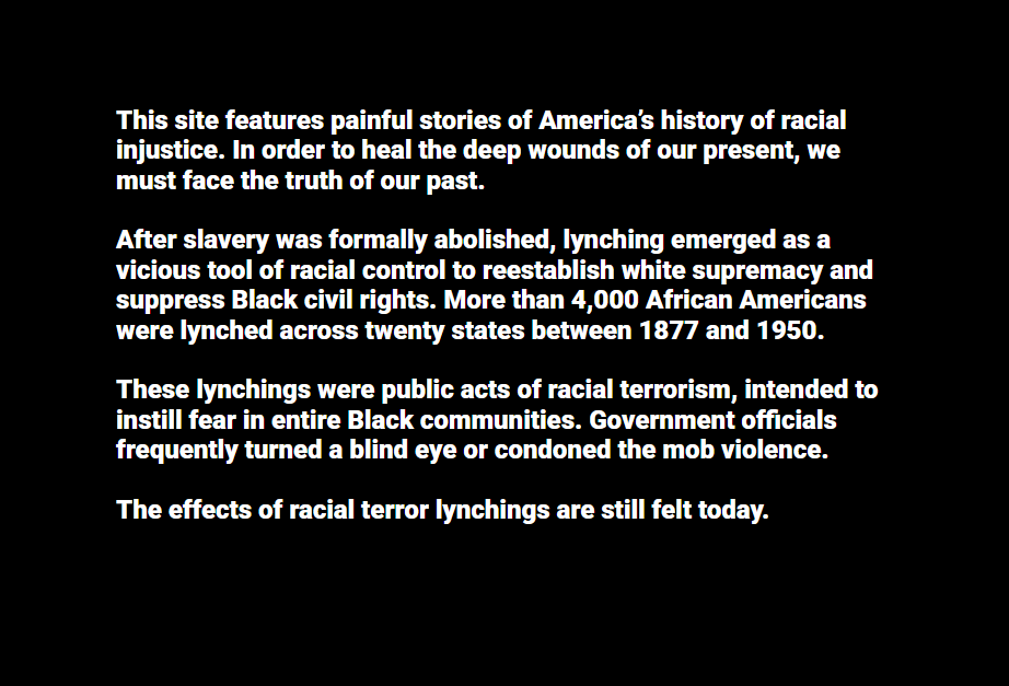
Some extra colorblind modes, perhaps with the number of lynchings attached to the county on the map, could help with accessibility here. A full definition of lynching would also help, as I’ve mentioned in my previous post on the site.
Google Arts & Culture
In Optional Project 37, I looked over, among other sites, Google’s Arts & Culture page. Assuming that at least some part of the company’s fortune had gone towards it, I had high expectations for this site’s accessibility. It seems to have done well in this regard; nearly everything it has in text is black on white or white on a darker color.
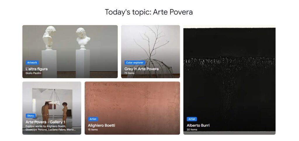
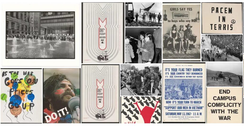
While the size of the site makes it impossible for me to check everything (at least for the scope of this project), the cultural readability also seems in good shape. This isn’t to say that cultures are well-represented; the Vietnam War display, for example, was almost exclusively American photography or posters and focused as much on American civilian life as it did anything inside Vietnam. This is a matter of perspective more than readability, however; it doesn’t seem like anything would be difficult to understand here, just relatively one-sided.
Without going into specific exhibits, I don’t have any large complaints for this site. I would recommend perhaps relabeling some displays to put their point of view (usually very American) in focus, however.