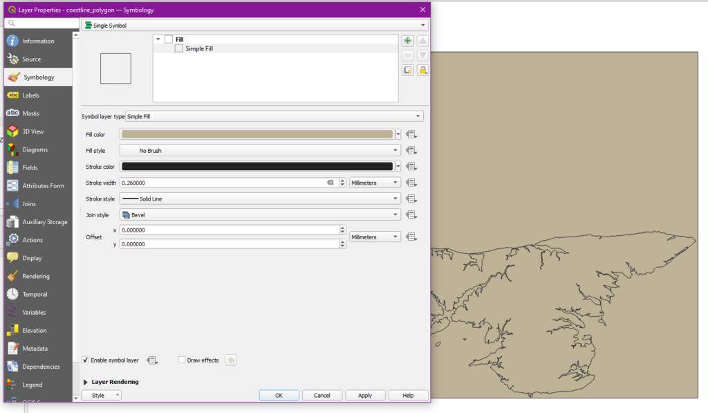
The QGIS project which we began in class went fairly quickly as I ran through the same steps again. Once I had the dataset downloaded and unzipped, I placed the coastline map into the program and swapped to a “No Brush” fill to eliminate the random colors the program seems insistent on adding.
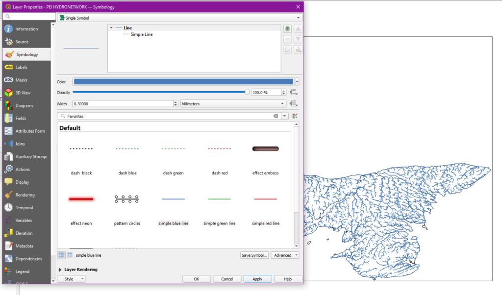
Using effectively the same process, I added in the waterways layer and changed to the “simple blue line” option to make the waterways look like waterways. As we did in class, I also went off script to thin down the lines on the map so they wouldn’t blend together too much. 0.3mm looked to be about right to me.
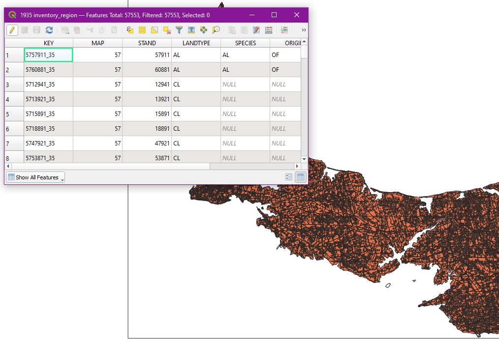
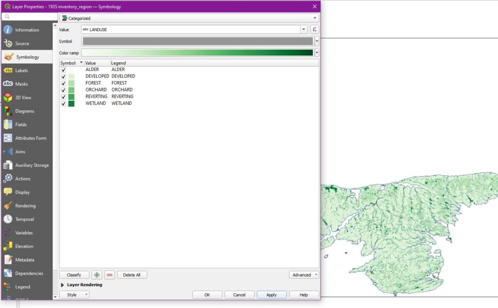
While not used at the moment, the presence of the “attribute table” is worth noting, providing direct access to the dataset. It is found in the right click menu.
Returning to the “properties” menu on the new dataset, I changed the overall symbology to “categorized,” the value to “LANDUSE,” and the color gradient to “greens.” I then removed the “other” category from the dataset. As in class, I also removed the hard lines surrounding all of the sectors on the map by altering the settings under “Symbol > Simple Fill”.
Once again, repeating the steps of the previous process, I filled out the road network and place names, adjusting the size and color a bit to make the outcome easier on the eyes.
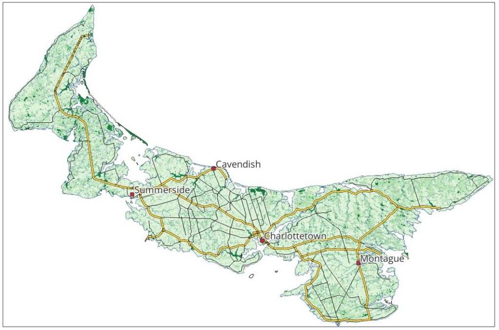
Finally, I added the Raster file and adjusted the coastline map, both using tools which I have already covered. See the finished product below.